Map Animation Tips for Journalists and News Creators
How newsrooms build a map explainer on deadline: what to show first, how to keep a moving story accurate, and how to get a broadcast-ready clip out in under two minutes.
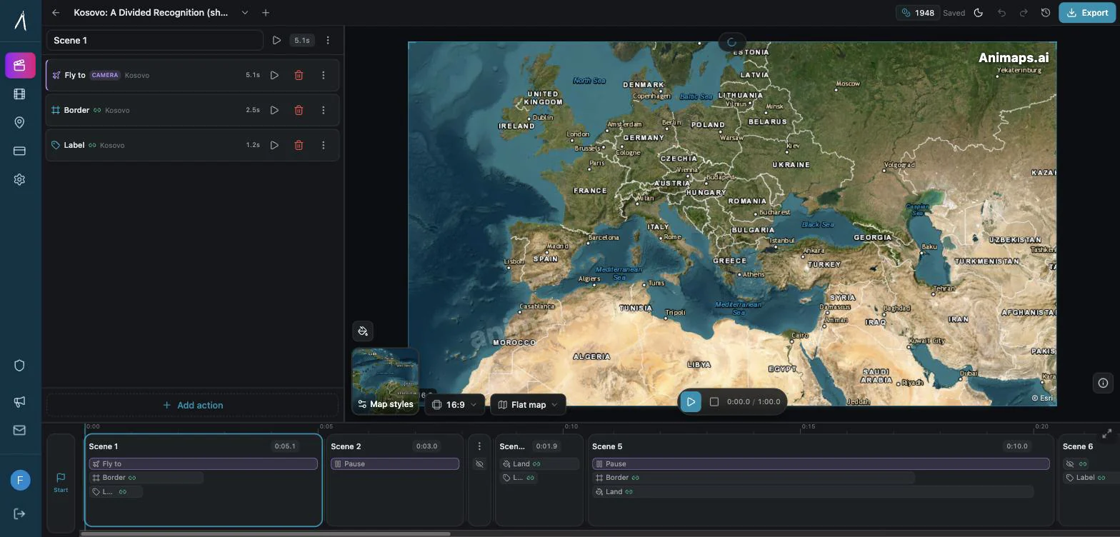
Preview & Editor advantage
Draft with AI prompts or templates, then refine every animation step in real time (zoom, opacity, border width, colors, bearing, tilt). Credits are used only when you render the final video.
Animaps Team
Content Creator
Map Animation Tips for Journalists and News Creators
Last updated: August 10, 2026
TL;DR
Map animations are essential for modern journalism. They help audiences instantly understand where events are happening, how situations evolve over time, and why geography matters to a story. AI-powered tools like Animaps let newsrooms produce broadcast-quality map animations in 60-90 seconds — fast enough for breaking news cycles.
The 2026 newsroom budget for one explainer clip (Animaps): up to 60 seconds of animation on the Pro plan, up to 150 steps, and 21 animation types covering camera moves, country borders, land fills, routes, labels and icons. Previewing and re-editing cost nothing; only the export spends a credit. That is what makes a second and third revision affordable an hour before air.
Related reading:
- Map animation maker hub: Create animated maps online
- Comparison hub: Map animation maker alternatives
- Newsroom workflow guide: News map workflows
- Geopolitical explainers: Geopolitics map animation
In a 24-hour news cycle, speed matters as much as accuracy. Audiences scroll past walls of text, but a well-crafted map animation stops them in their tracks.
Think about the stories that defined recent years: conflicts crossing borders, refugee routes spanning continents, election results shifting county by county, hurricanes carving paths across coastlines. Every one of these stories is fundamentally geographic. And every one is better told with a map.
This guide covers practical tips for journalists and news creators who want to use map animations effectively — whether you are working for a major outlet or running an independent newsletter.
Why Map Animations Work in Journalism
The Geography Gap
Most news consumers cannot locate key regions on a map. Studies consistently show that geographic literacy is lower than journalists assume. When you report on a conflict in a region your audience has never visited, you are asking them to fill in a mental picture they do not have.
A map animation closes that gap in seconds. It shows exactly where events are happening, how far apart locations are, and what the surrounding geography looks like.
Speed of Comprehension
A 5-second map animation communicates what three paragraphs of text cannot:
- Where something is happening (zoom to location)
- How far it is from something familiar (scale reference)
- What direction events are moving (animated path)
- How large the affected area is (highlighted region)
Viewers process spatial information visually much faster than they process it verbally.
Credibility and Trust
Professional map animations signal production quality. Audiences associate clean geographic visuals with credible reporting. A story about border disputes gains authority when you show the actual border. A migration story becomes more compelling when you trace the actual route.
6 Types of News Stories That Benefit from Map Animations
1. Conflict and Geopolitics
Conflicts are inherently geographic. Front lines shift. Territory changes hands. Supply routes open and close.
What to show:
- Zoom to the region to establish context
- Highlight contested territories with distinct colors
- Trace movement of front lines over time using border animations
- Show key cities and strategic locations with labels
AI prompt example: "Zoom to eastern Ukraine, highlight Donetsk and Luhansk regions, add labels for Kyiv, Kharkiv, and Mariupol"
Production time with Animaps: 60-90 seconds
2. Migration and Refugee Movements
Migration stories involve routes, distances, and multiple countries. Text descriptions of these journeys are abstract. Map animations make them concrete.
What to show:
- Trace the route from origin to destination
- Highlight countries along the path
- Show distance and terrain
- Mark key transit points and border crossings
You can create travel route animations that trace these paths with smooth camera movements, giving viewers the sense of the actual journey.
AI prompt example: "Show Central America, trace a path from Honduras through Guatemala and Mexico to the US border, highlight each country"
3. Elections and Voting Patterns
Election coverage is inherently spatial. Results vary by region, district, and precinct. Map animations let you show how results shift across geography.
What to show:
- Zoom to the country or state
- Highlight regions by voting result
- Show swing districts or battleground states
- Animate results appearing as they are called
AI prompt example: "Zoom to the United States, highlight Pennsylvania, Michigan, Wisconsin, and Arizona, add labels for each state capital"
4. Natural Disasters and Weather Events
Hurricanes, wildfires, floods, and earthquakes are geographic events. Their impact depends on path, proximity, and terrain.
What to show:
- Trace the path of a storm or fire
- Show proximity to populated areas
- Highlight affected regions
- Show before/after comparisons through sequential animations
AI prompt example: "Zoom to the Gulf of Mexico, trace a curved path from the Caribbean to Houston, highlight the Texas coastline"
5. Economic and Trade Stories
Supply chains, trade routes, and economic sanctions all have geographic dimensions that are difficult to explain without a map.
What to show:
- Trace trade routes between countries
- Highlight countries involved in sanctions or agreements
- Show shipping lanes and chokepoints
- Mark key ports and economic centers
AI prompt example: "Show the world, highlight China, trace a shipping route through the South China Sea, Strait of Malacca, Indian Ocean, Suez Canal to Rotterdam"
6. Public Health and Disease Tracking
Outbreaks spread geographically. Vaccination rates vary by region. Health infrastructure differs across countries.
What to show:
- Show spread patterns over time
- Highlight affected regions
- Mark healthcare facility locations
- Show containment zones
Practical Tips for Speed and Accuracy
Tip 1: Prepare Templates for Recurring Coverage
If you cover the same region regularly — a conflict zone, an election, a hurricane season — create a base animation once and reuse it.
How:
- Build your base map animation (zoom, angle, highlighted regions)
- Save the animation in Animaps
- For each new story, duplicate and modify
- Swap labels, update highlights, adjust paths
Time saved: Instead of 60 seconds per animation, recurring updates take 15-20 seconds.
Tip 2: Use the Right Aspect Ratio for Your Platform
Different platforms need different formats. Decide before you create, not after.
| Platform | Aspect Ratio | Resolution | Notes |
|---|---|---|---|
| Broadcast / YouTube | 16:9 | 1080p | Standard for video packages |
| Instagram Stories / TikTok | 9:16 | 1080p | Vertical for mobile-first |
| Twitter / X embeds | 16:9 or 1:1 | 720p | Shorter duration (under 15s) |
| Website embed | 16:9 | 720p | Lighter file size preferred |
| Instagram Feed | 1:1 | 1080p | Square format |
Animaps supports all of these export options: MP4 and GIF, 720p or 1080p, at 30 or 60 FPS.
Tip 3: Keep Animations Short
News audiences have short attention spans. Your map animation should communicate one idea clearly.
Guidelines:
- Breaking news context: 3-5 seconds (zoom + highlight)
- Explainer segment: 8-15 seconds (zoom + highlight + labels + path)
- Deep dive package: 20-40 seconds (multiple scenes with transitions)
Avoid cramming too much into one animation. If the story has multiple geographic elements, create separate short animations rather than one long one.
Tip 4: Prioritize Accuracy Over Style
In journalism, a beautiful but inaccurate map is worse than an ugly accurate one.
Accuracy checklist:
- [ ] Country borders are current and correct
- [ ] City locations are accurate
- [ ] Labels use the correct official names (or widely-recognized names)
- [ ] Scale is not misleading
- [ ] Colors do not imply unintended meaning (red does not always mean "bad")
Animaps draws from a database of 180,000+ locations with verified coordinates, which helps ensure geographic accuracy out of the box.
Tip 5: Add Context Labels
A map without labels is a puzzle. Always include:
- Country names for international stories
- City names for key locations
- Region names when relevant
- Distance references when scale matters
AI prompt example: "Zoom to the Middle East, highlight Israel and Lebanon, add labels for Jerusalem, Beirut, and the Golan Heights"
Labels make your animation self-explanatory. Viewers should understand the geographic context without needing narration.
Tip 6: Use the 3D Globe for International Context
For stories that span large distances or involve multiple continents, a 3D globe view provides better spatial context than a flat map.
Animaps renders on both a flat preview map (MapLibre) and a 3D globe (Cesium). The globe view is particularly effective for:
- Intercontinental flight or shipping routes
- Stories involving distant regions
- Establishing shots that zoom from global to local
- Any story where Earth's curvature affects perception of distance
Breaking News Workflow
When a story breaks, you need a map animation in minutes, not hours. Here is a practical workflow using AI-powered tools.
The 3-Minute Breaking News Workflow
Minute 1: Create the animation
- Open Animaps map animation maker (5 seconds)
- Type a natural language prompt describing the location and context (15 seconds)
- Click Generate and preview (30 seconds)
- Quick adjustments if needed (10 seconds)
Minute 2: Export
- Select aspect ratio for your platform (5 seconds)
- Choose resolution and format (5 seconds)
- Export renders in the cloud (30-60 seconds)
Minute 3: Publish
- Download the file
- Upload to your CMS, video editor, or social platform
- Publish
Total: Under 3 minutes from idea to published map.
Compare this with traditional methods:
- After Effects: 45-90 minutes minimum
- Manual tools: 15-30 minutes
- Hiring a designer: hours to days
For breaking news, AI-powered speed is not a convenience — it is a competitive advantage.
Case Study Scenarios
Scenario 1: Breaking Conflict Coverage
Story: Armed clashes reported in a region most viewers cannot locate.
Animation plan:
- Start with a wide continental view (establishing context)
- Zoom to the country (identifying the nation)
- Highlight the affected region (pinpointing the area)
- Add labels for key cities (providing reference points)
- Trace borders of contested territory (showing the stakes)
AI prompt: "Start from the world, zoom to East Africa, fly to Ethiopia, highlight the Tigray region, add labels for Addis Ababa and Mekelle, trace the border of Tigray"
Time: 90 seconds including export
Scenario 2: Hurricane Tracking
Story: Major hurricane approaching the coast.
Animation plan:
- Wide view of the ocean basin
- Trace the projected path
- Zoom to the landfall area
- Highlight counties in the projected path
- Label major cities in the danger zone
Time: 2 minutes including customization
Scenario 3: Election Night Coverage
Story: State-by-state results coming in.
Animation plan:
- Show the full country
- Highlight battleground states
- Zoom to each key state as results come in
- Label state capitals and key cities
Pro tip: Pre-build the base animation before election night. On the night, duplicate and modify colors as results come in.
Ethics and Best Practices for News Maps
Avoid Misleading Projections
Map projections distort reality. The Mercator projection makes countries near the poles appear much larger than they are. Be aware of how your chosen view might mislead.
Use Neutral Colors by Default
Color carries meaning. In Western contexts, red often implies danger or opposition, while blue implies calm or support. Unless you are intentionally coding results (election maps), use neutral colors.
Neutral options:
- Gold or amber for highlights
- Light blue for water features
- Gray for non-highlighted regions
- White labels on dark backgrounds for readability
Credit Your Sources
If your map animation includes data (voting results, casualty figures, territory control), credit the source. Even if the animation itself is generated by a tool, the underlying data should be attributed.
Respect Disputed Territories
Some borders are disputed. Some place names are contested. When covering sensitive regions:
- Acknowledge disputed status
- Use internationally recognized terminology
- Consider showing multiple perspectives when appropriate
Tools Comparison for Newsroom Use
| Feature | Animaps (AI) | After Effects + GEOlayers | Google Earth Studio |
|---|---|---|---|
| Time per animation | 60-90 seconds | 45-90 minutes | 15-30 minutes |
| Learning curve | None | 150+ hours | 10-20 hours |
| Breaking news capable | Yes | No (too slow) | Partially |
| Custom labels | Yes | Yes | Limited |
| Border highlighting | Yes | Manual | No |
| Export formats | MP4, GIF | Any | MP4 (frames) |
| Cost | Free-$199/year | $660+/year | Free |
| Team collaboration | Browser-based | Desktop only | Browser |
| 3D globe | Yes | Plugin needed | Yes |
For newsrooms that need speed above all else, AI-powered tools like Animaps provide the fastest path from story to published visual. For deep investigative pieces where you need complete custom control, After Effects remains the most flexible option.
For a deeper comparison, see AI-Powered Map Animations vs Traditional Methods.
Building a Map Animation Workflow for Your Newsroom
Step 1: Audit Your Current Coverage
Look at your last 20 published stories. How many had a geographic component? How many could have benefited from a map animation? Most newsrooms find the answer is 30-50% of their output.
Step 2: Identify Recurring Formats
Most newsrooms have recurring story types:
- Weekly regional roundups
- Monthly economic reports
- Ongoing conflict coverage
- Weather and disaster reporting
Build template animations for each format.
Step 3: Train Your Team
AI-powered tools have virtually no learning curve, but your team still needs to know:
- When to use a map animation (geographic stories)
- What aspect ratio to use (platform-dependent)
- How to write effective prompts (specific locations and actions)
- Where to store and organize animations
Step 4: Integrate into Your CMS
Export animations as MP4 files and integrate them into your publishing workflow:
- Embed directly in web articles
- Add to video packages in your NLE
- Upload to social media scheduling tools
- Include in newsletter templates
Common Mistakes to Avoid
1. Overcomplicating the Animation
A breaking news map needs one thing: to show where something is happening. Do not add 15 labels, 8 highlighted countries, and a complex camera orbit when a simple zoom-and-highlight tells the story.
2. Using Outdated Borders
Political boundaries change. Make sure your map tool uses current border data. Animaps maintains an up-to-date geographic database, but always verify for sensitive regions.
3. Ignoring Mobile Viewers
More than 60% of news is consumed on mobile devices. Test your animation on a phone screen. If labels are unreadable or the highlighted area is too small, adjust your framing.
4. Forgetting Accessibility
- Include clear labels (do not rely on color alone)
- Use sufficient contrast
- Keep text large enough to read on small screens
- Add alt text when embedding in web articles
5. Publishing Without Verification
Just because the AI generated an animation does not mean every element is correct. Verify:
- Location accuracy
- Border accuracy
- Label spelling
- That the animation matches your story
Getting Started
For Individual Journalists
- Sign up for a free Animaps account (12 credits/month, no credit card)
- Create your first map by typing a location prompt
- Export and embed in your next story
- Iterate on prompts to refine your style
For Newsrooms
- Evaluate with a free trial
- Build templates for your most common story types
- Train reporters to write effective prompts
- Integrate into your publishing workflow
The map animation maker is browser-based, so there is nothing to install and no IT department approval needed.
The Bottom Line
Map animations are no longer a luxury reserved for broadcast networks with dedicated graphics departments. AI-powered tools have made professional map animations accessible to every journalist, from major outlets to independent newsletters.
The key principles remain the same as they have always been in journalism: accuracy first, clarity second, speed third. But with AI tools reducing production time from hours to seconds, the barrier between "we should have a map for this story" and "we have a map for this story" has effectively disappeared.
In a world where every news outlet is competing for attention, the ones that show their audience where things are happening — not just tell them — will earn more trust and more engagement.
Get started:
- Free: 12 credits/month, all features, no credit card
- Create your first news map now: animaps.ai
Related Articles:
Keywords: map animations for journalism, news map animations, journalist map tools, breaking news maps, AI map animations for news, newsroom visual storytelling, geographic news graphics, conflict map animation, election map animation
Tags
Related reading
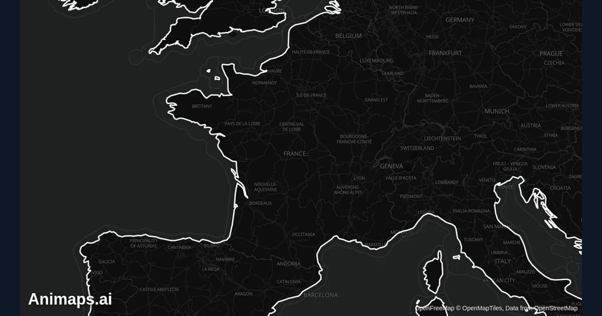
Best Practices for Educational Map Animations
Educational map animations have revolutionized how we teach geography, history, and social studies. When done right, they can transform abstract concepts into visual stories that students remember long after the lesson ends.
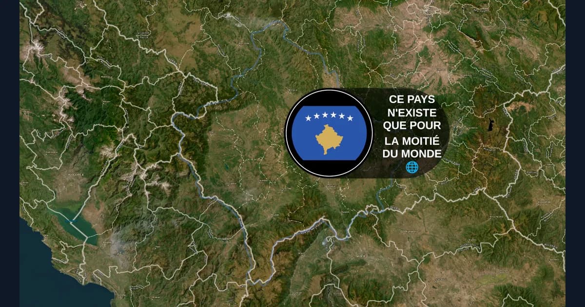
Animaps vs GEOlayers: Specialized Tool or After Effects Plugin?
You're comparing Animaps and GEOlayers for creating map animations. Both are purpose-built for geographic content, but take fundamentally different approaches. GEOlayers brings maps into After Effects, requiring AE proficiency plus 20+ hours of plugin learning. Animaps is a standalone browser platform with zero prerequisites and a 30-minute learning curve. This comparison examines workflows, requirements, costs, and use cases.
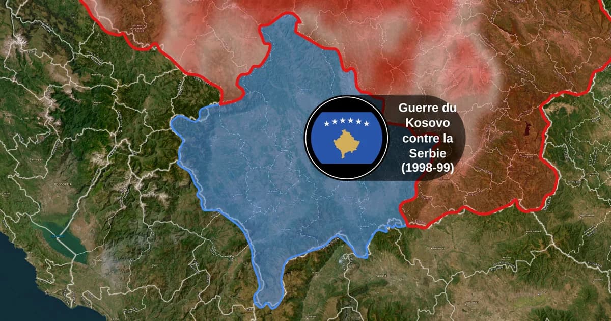
Map Animation Tools: How to Create Animated Maps in 2026
A map animation tool turns a place and a sentence into a moving map video - camera flights, country borders, flag fills, routes, labels - without After Effects, plugins or keyframes. Here is what to look for, and what Animaps does.
Browse every article in the Animaps blog.